CONNECTED PHYSICAL PRODUCTS
MAKE THE NEXT
TAP
MEAN MORE.
Zexolt gives the physical moments in your day a useful digital direction — an introduction, a destination, or a response.
 Zexolt Tap
Ready to Connect
Tap Zexolt card near top
Alex Vance
Principal Director · Zexolt
San Francisco, CA
ZEXOLTPHYSICAL TOUCHPOINT
TITANIUM BLACK
02 — THE IDEA
THE INTERACTION IS FAMILIAR.
THE OUTCOME CAN BE MUCH MORE CONSIDERED.
MAKE A CONNECTION
Let a handover open the information that makes a conversation useful.
GUIDE A DECISION
Point a visitor toward the page, menu, campaign, or resource they need now.
COLLECT A SIGNAL
Create an easy path to feedback, registration, and the response you need.
PRECISION HARDWARE. DIGITAL CONTINUITY.
Every card, tag, and touchpoint is unified by the official Zexolt identity—bringing tangible weight to modern digital interactions.

03 — HOW IT WORKS
A BETTER PATH FROM ATTENTION TO ACTION.
There is no app to explain to the visitor. Just a quick, familiar interaction that moves them toward the right next step.
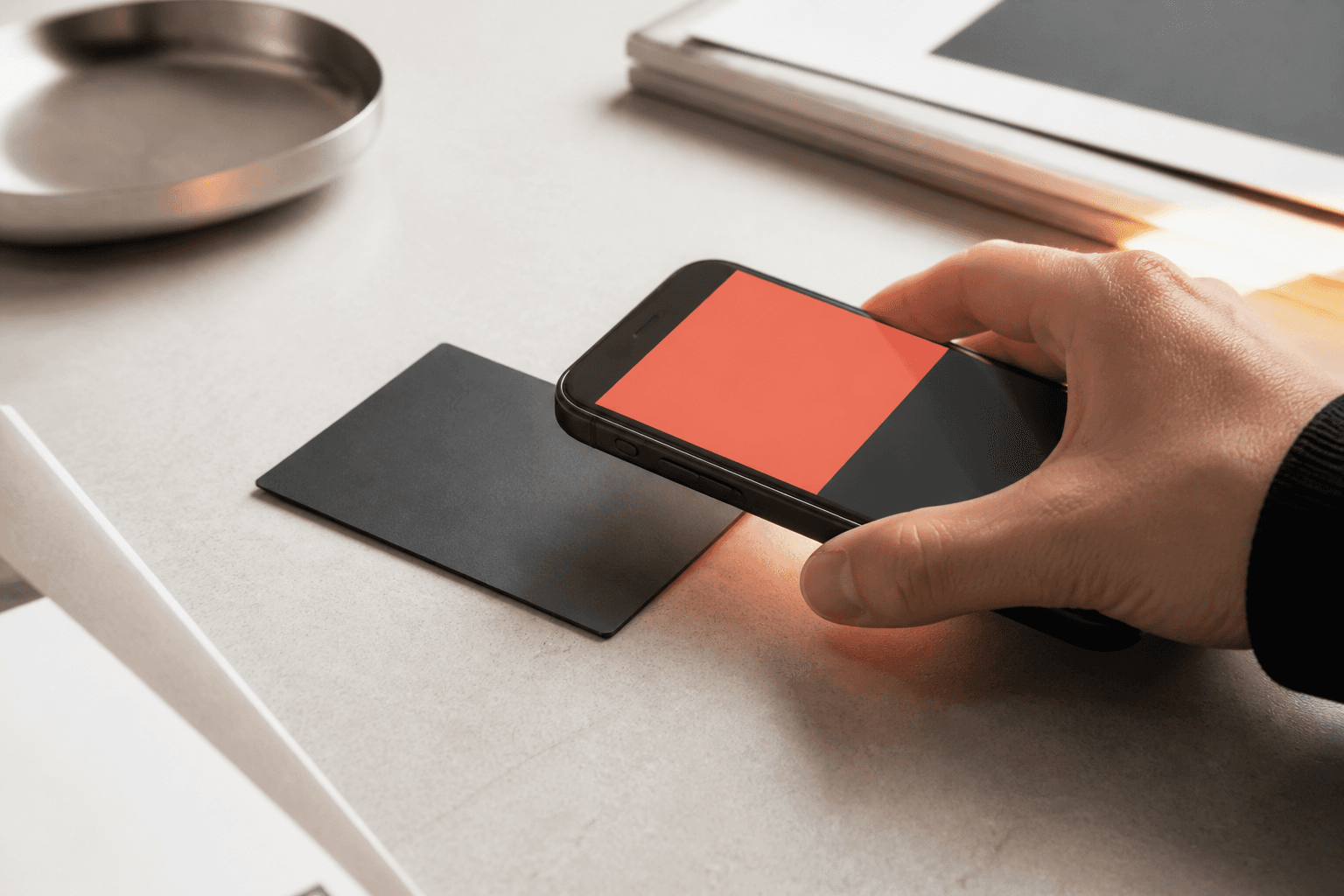
Physical Touchpoint Active
Zero App Installation Required
Place a touchpoint
Use a card, tag, sticker, or stand where a person is ready to act.
Connect the destination
Set the digital experience that should open after a tap or scan.
Manage the experience
Keep the destination current from a workspace that stays with the product.
04 — THE ZEXOLT SYSTEM
ONE IDEA.
FOUR WAYS TO PUT IT TO WORK.
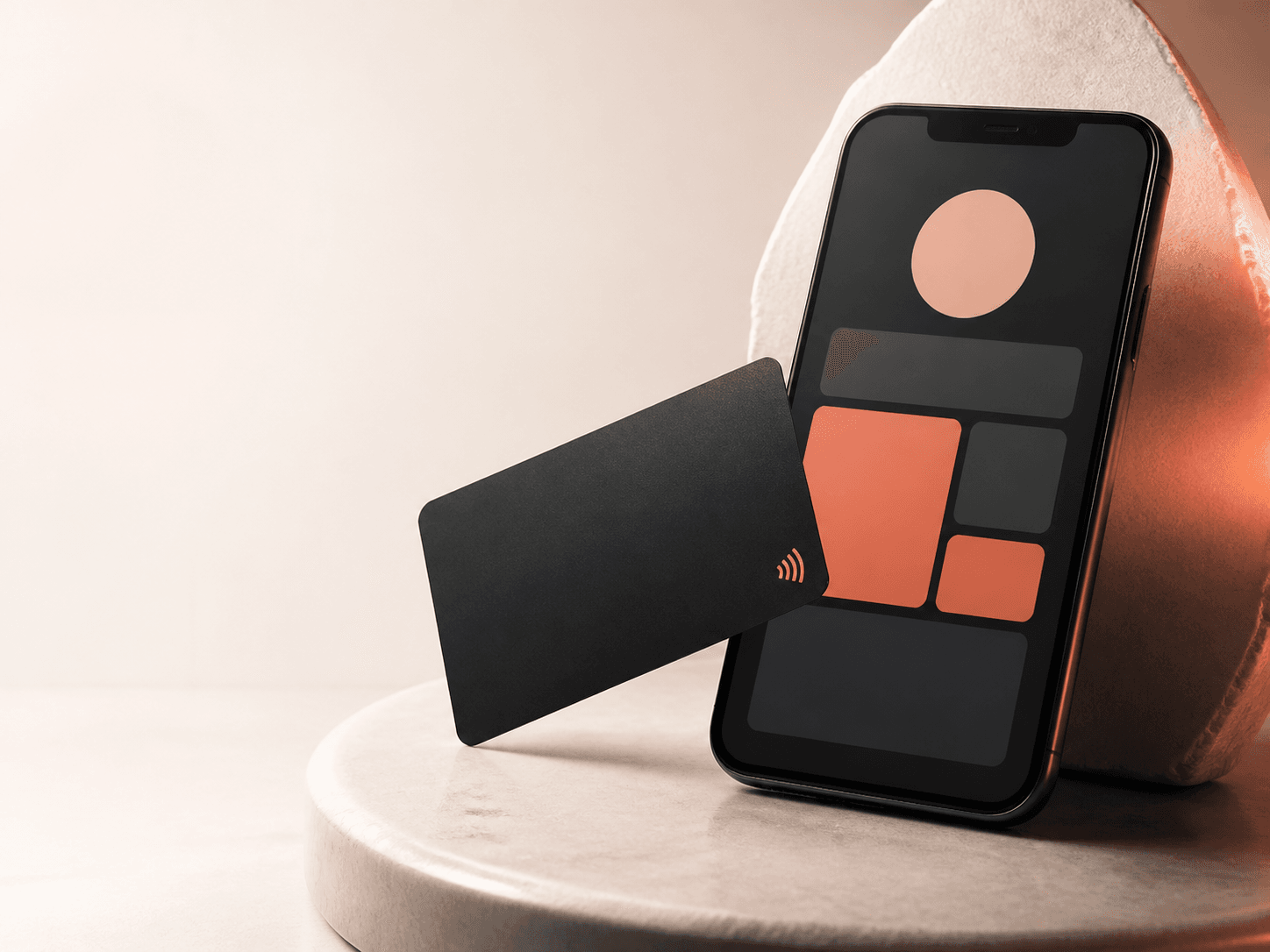
Personal cards
Turn one introduction into a profile that is ready to be useful.
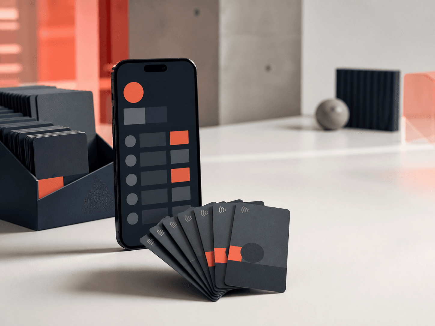
Corporate cards
Give every team member a consistent, managed way to connect.
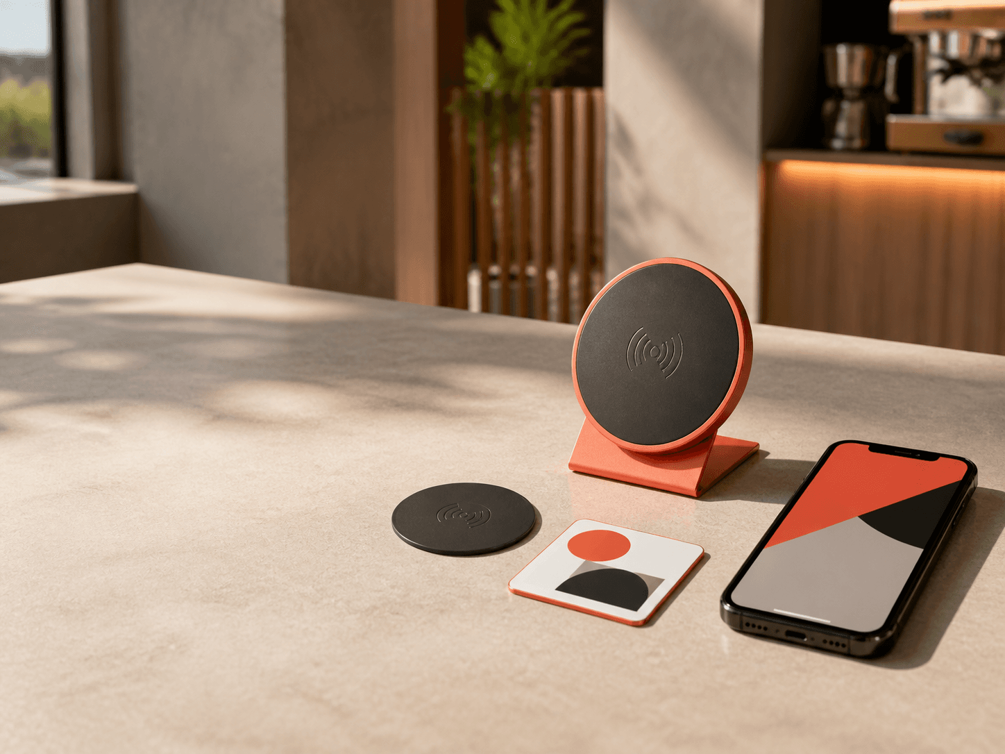
Smart redirects
Guide a visitor to the link that matters today.
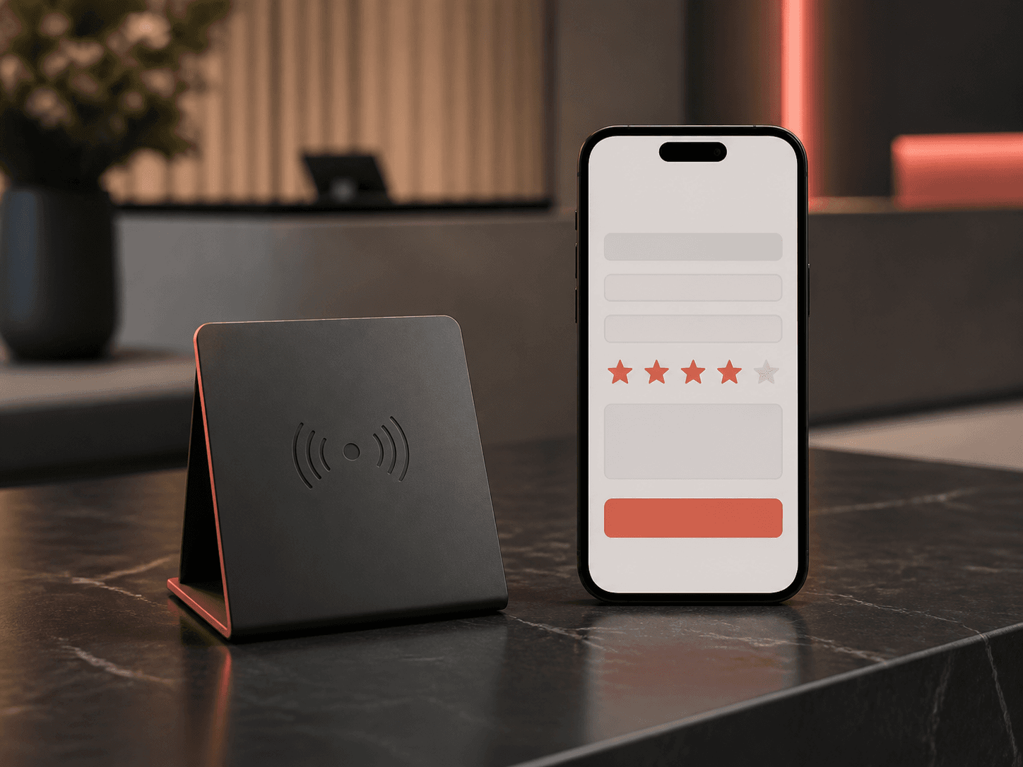
Smart forms
Ask for a response at the moment someone is most ready to give it.
05 — HARDWARE CATALOG
PRODUCTS THAT BELONG IN THE REAL WORLD.
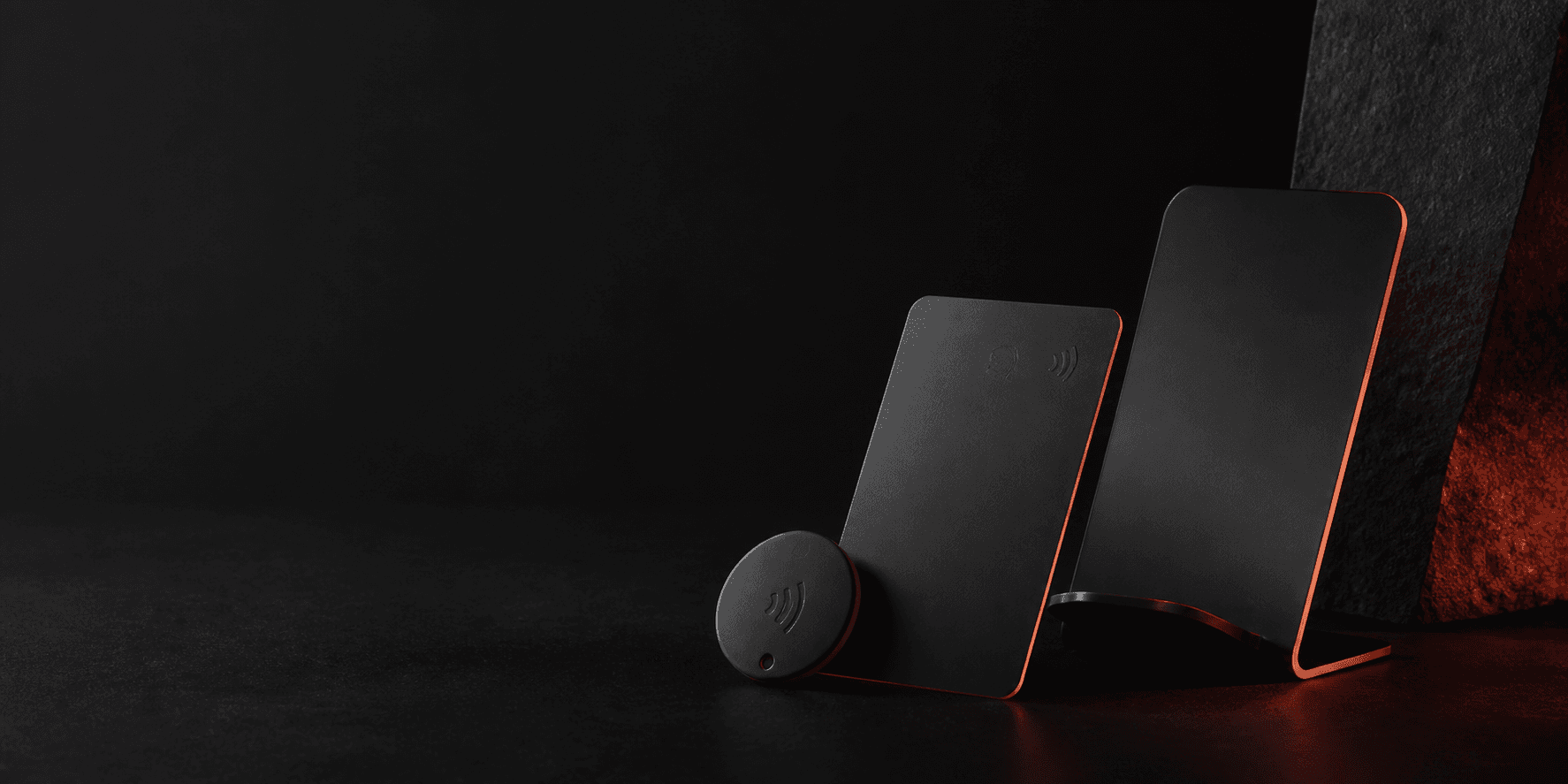
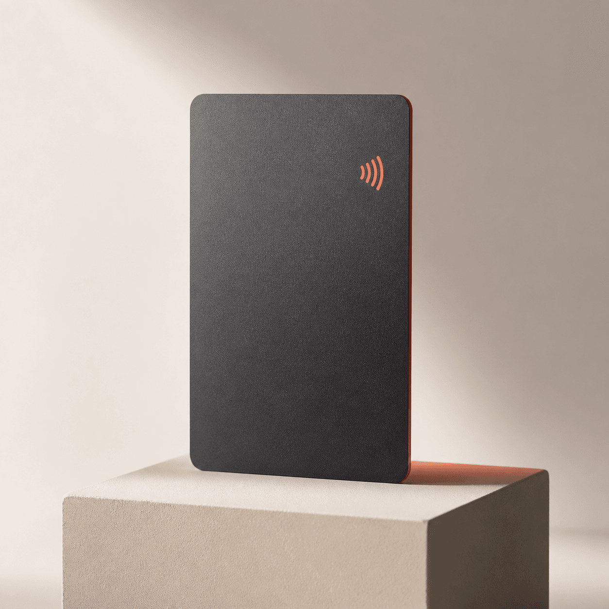 CARD
CARDA card for the handover.
- Matte titanium black finish
- High-range NTAG216 chip
- Custom laser engravable
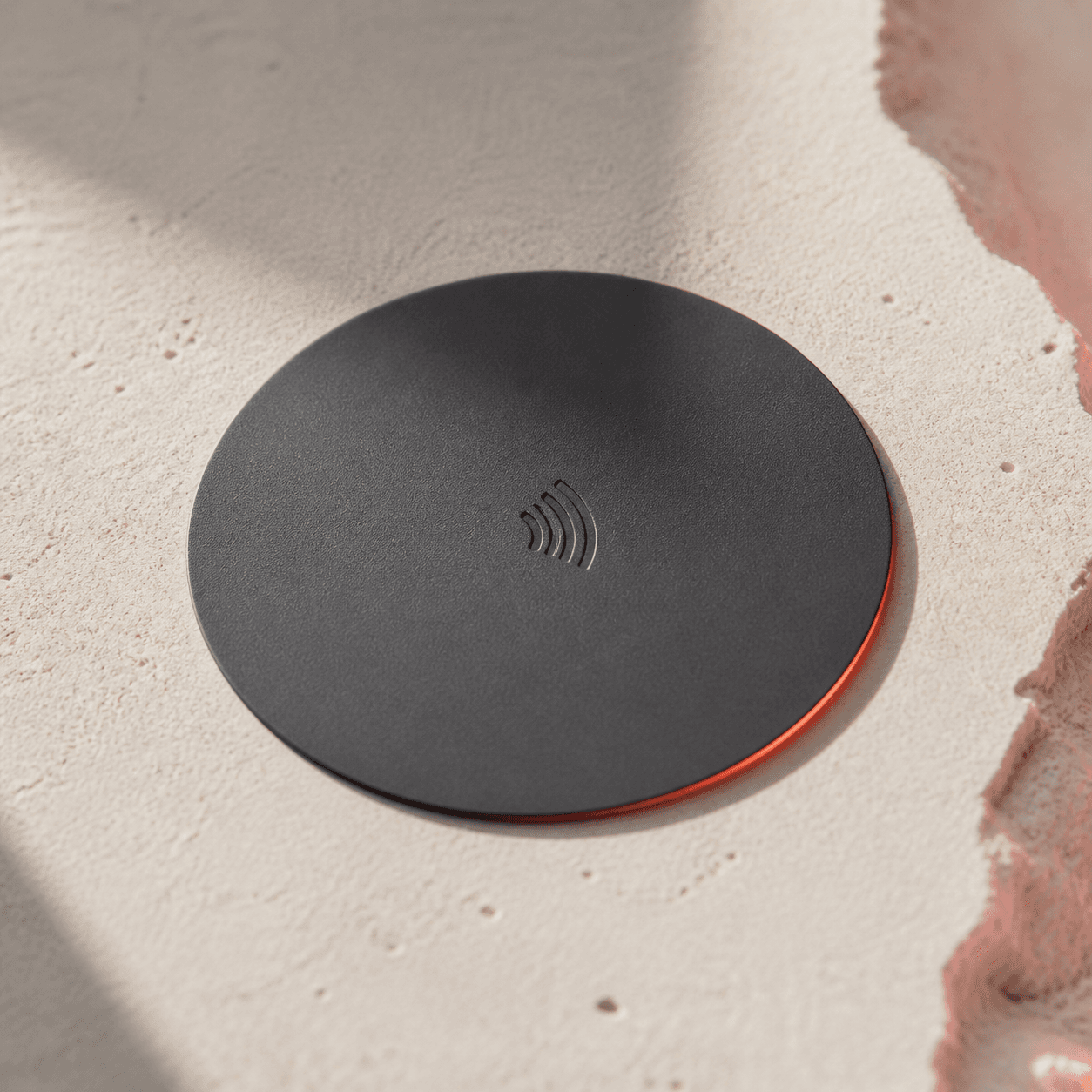 TAG
TAGA tag for the surface.
- 3M industrial adhesive backing
- Waterproof IP68 epoxy tag
- Table & counter ready
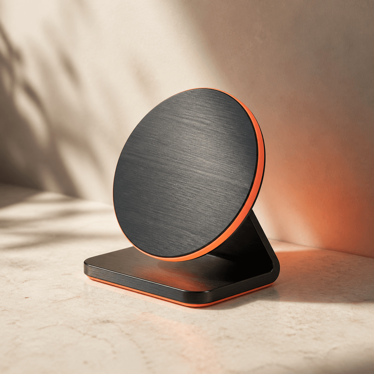 STAND
STANDA stand for the shared space.
- Precision weighted aluminum base
- Dual NFC + dynamic QR faceplate
- Ideal for receptions & venues
06 — SYSTEM ARCHITECTURE
END-TO-END SIGNAL FLOW.
From physical contact to sub-second dynamic routing and live activity analytics.
PHYSICAL TOUCHPOINT
Titanium Card, Tag, or Stand placed in environment.
NFC / QR SIGNAL
High-frequency 13.56MHz NFC or encrypted QR trigger.
ZEXOLT ROUTING LAYER
Sub-millisecond dynamic routing engine & access rules.
DIGITAL DESTINATION
Live Digital Profile, Smart Form, or custom URL.
ANALYTICS & FLEET
Real-time tap metrics, location insights & fleet logs.
07 — FAQ
EVERYTHING STARTS WITH A SIMPLE INTERACTION.
GIVE THE NEXT
INTERACTION
SOMEWHERE USEFUL TO GO.
Whether you are connecting a person, a place, or a campaign response, start with the physical tap that makes the difference.